Widget Connectivity
Widget Connectivity
Source code: https://github.com/the-virtual-brain/tvb-widgets
This is part of a Pypi release: https://pypi.org/project/tvb-widgets/
tvb-widgets is also already installed in the official image released for EBRAINS lab, where you can test it directly.
Purpose
Jupyter lab widgets for visualizing or do operations on a connectivity
1. ConnectivityWidget
Visualization:
- in 2D can visualize weights or tracts matrixes;

- in 3D can visualize regions and their respective edges

- to show/hide the Connectivity centers/edges, access the controls available in the upper-right corner:

Operations:
- remove selected nodes from a connectivity, results in a new connectivity containing only the nodes that were not selected;
- remove unselected nodes from a connectivity, results in a new connectivity containing only the selected nodes;
- remove unselected edges, results in a new connectivity with the same number of regions but without the edges of unselected regions;
- remove selected edges, results in a new connectivity with the same number of regions but without the edges of selected regions.
Usage:
- after instantiating the widget it allows export of the currently selected connectivity:
from tvb.datatypes.connectivity import Connectivity
conn = Connectivity.from_file() # defaults to connectivy_76.zip
conn.configure()
wid = ConnectivityWidget(conn, default_active_tab='viewers') # default_active_tab can be any value between 'viewers'|'operations'|'both'
display(wid)
# ....do some operations...
# replace None in the method below with the gid of the connectivity you wish to export
# if no gid is provided it will export the connectivity currently viewed
new_connectivity = wid.get_connectivity(gid=None)
new_connectivity
2. SpaceTimeVisualizerWidget
- this is a 3D representation of the delayed-connectivity structure
- the space-time visualizer disaggregate the weights matrix and each slice corresponds to connections that fall into a particular distance (or delay) range. The first slice is the complete weights matrix. Click on any of the subsequent slices to see the corresponding 2D matrix plot. Also, choose the conduction speed and ranges you are interested to explore and the plot will update instantly.

- clicking on a connectivity slice, brings that particular slice in the center to be visualized in 2D mode. Click on the main slice to return to the main view.


- in the tab called Plots Overview you get a 2D summary of all the current slices

3. Connectivity React Widget
The Connectivity React Widget provides an interactive visualization of a TVB Connectivity datatype, allowing users to explore brain regions and the connections between them.
The widget provides:
- visualization of brain regions and their connectivity
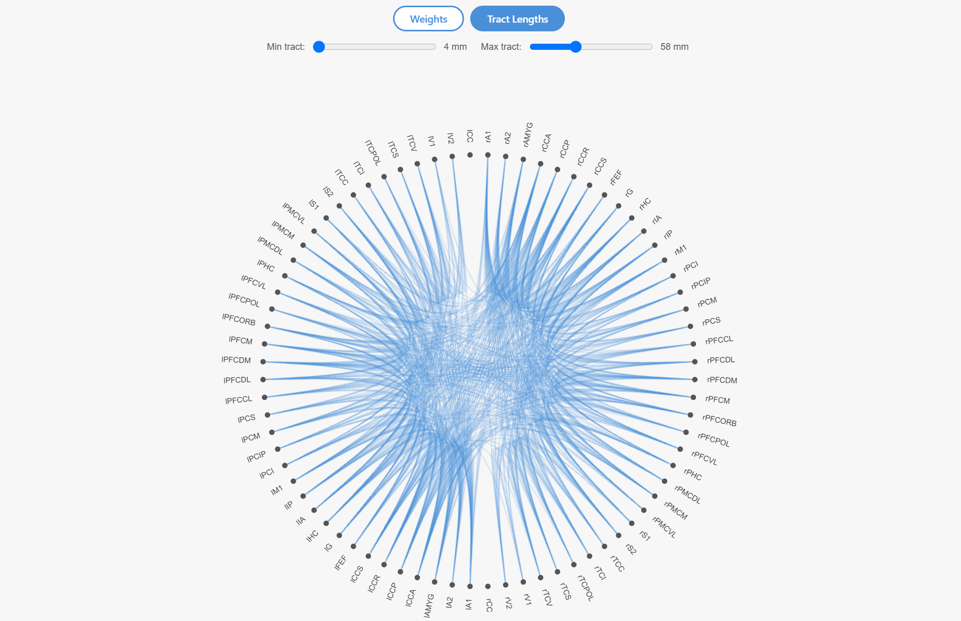
- switching between connectivity weights and tract lengths
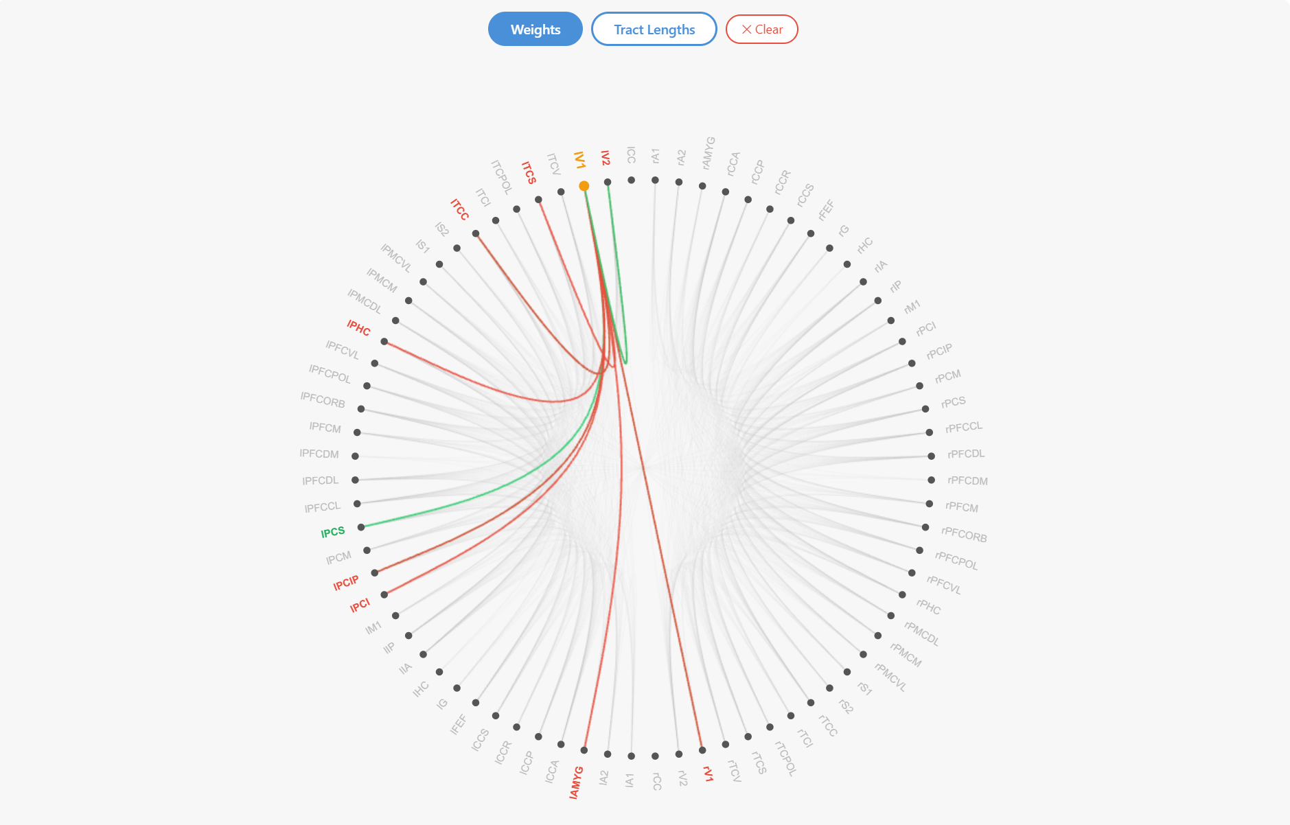
- highlighting of incoming and outgoing connections when selecting a brain region
- filtering of connections based on a tract-length range
The visualization combines Canvas rendering for connectivity edges with interactive SVG elements for brain-region labels, allowing large connectivity networks to be explored efficiently.
Usage
The widget can be used with a TVB Connectivity datatype in a Jupyter notebook.
2
3
4
5
6
7
8
from tvbwidgets.ui.connectivity_react.connectivity_widget import ConnectivityWidget
conn = Connectivity.from_file()
conn.configure()
w = ConnectivityWidget(conn)
display(w)
Visualization
- Selecting a brain region highlights its incoming and outgoing connections, making the direction of connectivity between regions easier to inspect.
- When tract lengths are displayed, the visible connections can also be filtered by specifying a minimum and maximum tract-length range.